Saheb App Design System

1. Purpose of This Documentation
This presentation explains the design and technical decisions behind our application features.
a. We will be covering:
1. Technology Stack
-
Backend framework
-
Web frontend framework
-
Mobile frontend framework
-
Database technology (PostgreSQL, MySQL, etc.)
-
UI libraries
-
Supporting libraries and tools (state management, datafetching, utilities)
2. Application Architecture & Project Structure
-
Backend folder structure
-
Frontend folder structure
-
Design patterns and development strategies
3. Localization & Language Support
-
Multi-language database translation strategy
-
RTL (Right-to-Left) support on web and mobile
-
Hijri calendar localization
4. Core Domain Logic
-
Qibla calculation logic
-
Prayer time calculation methods
-
Hijri time caulculation methods
5. Media Management
-
Audio resource handling (Sermon / موعظة)
-
Video hosting and streaming strategy
6. Notifications & Communication
-
Timezone-aware push notification system
-
Email notification architecture
-
Notification reliability and crash handling
-
Scheduling notificaiton with cron
8. Application Standards
-
Request logging
-
User event and activity tracking
-
Error and crash reporting
-
API versioning
b. How Each Section Is Documented
For every section in this documentation, we consistently answer the following questions:
-
What solution did we choose?
-
Why did we choose this solution?
-
What are the pros (optional) and cons of this solution?
-
What alternative approaches were considered?
1. Technology Stack
a. Backend Framework
What solution did we choose?
We chose Nodejs + Expressjs + NestJS as the backend framework.
Why did we choose this solution?
- Team is more experienced with
- Widely used on our code base
-
Built with TypeScript by default
Pros
-
Clear module-based architecture
-
Strong TypeScript support
-
Easy integration with databases, authentication, and queues
-
Express Rich community
-
Supports modular development and scalability
-
Fits well for APIs serving web and mobile apps
-
One backend server for both mobile and web
Cons
-
Slightly more boilerplate
-
Integration Complexity with Some Legacy Libraries
Alternative Approaches
-
Express.js
-
Fastify
-
Laravel (PHP)
-
Spring Boot (Java)
b. Web Frontend Framework
What solution did we choose?
We chose Next.js using the App Directory.
Why did we choose this solution?
-
Built-in support for modern React features
-
File-based routing with the App Directory
-
Good integration with backend APIs
- Built-in layouts, and loading states, server errors handlings
Pros
-
Clear and scalable project structure
-
Server-side rendering and static generation
-
Strong support for SEO and web performance
-
Server Components
Cons
-
Some ecosystem libraries are still adapting
-
Build & Deployment Complexity
-
Rapidly Changing Features
Alternative Approaches
-
React ( Vite )
-
React (Tanstack start )
-
Nuxt.js
-
Angular
c. Mobile Frontend Framework
What solution did we choose?
We chose React Native with Expo.
Why did we choose this solution?
-
Allows building iOS Android apps and web from a single codebase
- Quick testing on simulators, emulators, and real devices
-
Built-in support for push notifications, sensors, and device APIs
-
Large community and ecosystem
- Deployment built-in (EAS Hosting)
- Routing and Authentification built in
- Assets management
- AI intergration (expo mcp server)
Cons
-
Some native modules require custom development (Ejecting from Expo)
Alternative Approaches
-
Pure React Native (without Expo)
-
Flutter
-
Native iOS (Swift) / Android (Kotlin) development
d. Database Technology
What solution did we choose?
We chose PostgreSQL as the database for our application.
Why did we choose this solution?
- Team is more experienced with
- Good ecosystem and tooling support
-
Reliable and stable relational database
-
Widely used in the industry with large community and resources
-
Works well with TypeORM for Nestjs integration
Pros
-
Good ecosystem and tooling support
-
Open-source and actively maintained
-
Supports advanced features like JSON, full-text search, and indexes
-
Strong support for transactions
Cons
-
Can be more complex to set up than simpler databases (like SQLite)
-
Overkill for very small projects
e. UI Libraries
1. Web Frontend component library
What solution did we choose?
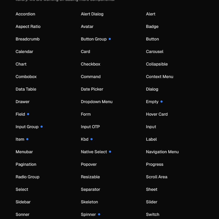
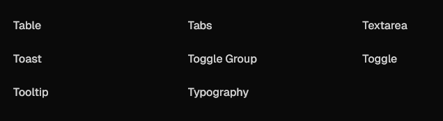
We chose shadcn/ui integrated with Tailwind CSS, and Figma designs for reference.
Why did we choose this solution?
- Tailwind provide CSS utility classes to speed up development, so instead of writing custom CSS files, we style components directly using small, reusable classes
- Without Tailwind (Traditional CSS):
-
<button class="btn">
  Save
</button>
.btn {
  background-color: blue;
  color: white;
  padding: 8px 16px;
  border-radius: 6px;
}<button class="bg-blue-600 text-white px-4 py-2 rounded-md">
Save
</button>
Provides a ready-to-use component library built on Tailwind CSS
Tailwind allows fast and consistent styling across the app Open Code: The top layer of your component code is open for modification-
import * as React from "react"
import { Slot } from "@radix-ui/react-slot"
import { cva, type VariantProps } from "class-variance-authority"

import { cn } from "@/lib/utils"

const buttonVariants = cva(
  "inline-flex items-center justify-center gap-2 whitespace-nowrap rounded-md text-sm font-medium transition-all disabled:pointer-events-none disabled:opacity-50 [&_svg]:pointer-events-none [&_svg:not([class*='size-'])]:size-4 shrink-0 [&_svg]:shrink-0 outline-none focus-visible:border-ring focus-visible:ring-ring/50 focus-visible:ring-[3px] aria-invalid:ring-destructive/20 dark:aria-invalid:ring-destructive/40 aria-invalid:border-destructive",
  {
    variants: {
      variant: {
        default: "bg-primary text-primary-foreground hover:bg-primary/90",
        destructive:
          "bg-destructive text-white hover:bg-destructive/90 focus-visible:ring-destructive/20 dark:focus-visible:ring-destructive/40 dark:bg-destructive/60",
        outline:
          "border bg-background shadow-xs hover:bg-accent hover:text-accent-foreground dark:bg-input/30 dark:border-input dark:hover:bg-input/50",
        secondary:
          "bg-secondary text-secondary-foreground hover:bg-secondary/80",
        ghost:
          "hover:bg-accent hover:text-accent-foreground dark:hover:bg-accent/50",
        link: "text-primary underline-offset-4 hover:underline",
      },
      size: {
        default: "h-9 px-4 py-2 has-[>svg]:px-3",
        sm: "h-8 rounded-md gap-1.5 px-3 has-[>svg]:px-2.5",
        lg: "h-10 rounded-md px-6 has-[>svg]:px-4",
        icon: "size-9",
        "icon-sm": "size-8",
        "icon-lg": "size-10",
      },
    },
    defaultVariants: {
      variant: "default",
      size: "default",
    },
  }
)

function Button({
  className,
  variant = "default",
  size = "default",
  asChild = false,
  ...props
}: React.ComponentProps<"button"> &
  VariantProps<typeof buttonVariants> & {
    asChild?: boolean
  }) {
  const Comp = asChild ? Slot : "button"

  return (
    <Comp
      data-slot="button"
      data-variant={variant}
      data-size={size}
      className={cn(buttonVariants({ variant, size, className }))}
      {...props}
    />
  )
}

export { Button, buttonVariants }
-
npx shadcn@latest add button
- AI-Ready: Open code for LLMs to read, understand, and improve (mcp server).
-
{
  "registries": {
    "@acme": "https://acme.com/r/{name}.json"
  }
}
-
-
Figma designs give a visual reference for UI consistency
- Huge ecosystem built around shadcn.
-
Fits well with React and Next.js
- Very customizable :
- you can change the whole app theme by changing only globall.css file :
- change component source code.
Pros
-
Lightweight and modern styling approach
Cons
-
Learning curve for Tailwind if new to utility-first CSS
Alternative Approaches
-
Material-UI (MUI)
-
Ant Design
-
Chakra UI
-
Custom components from scratch