Saheb App Design System

1. Purpose of This Documentation
This presentation explains the design and technical decisions behind our application features.
a. WeI will be covering:
1. Technology Stack
-
Backend framework
-
Web frontend framework
-
Mobile frontend framework
-
Database technology (PostgreSQL, MySQL, etc.)
-
UI libraries
-
Supporting libraries and tools (state management, datafetching, utilities)
2. Application Architecture & Project Structure
-
Backend folder structure
-
Frontend folder structure
-
Design patterns and development strategies
3. Localization & Language Support
-
Multi-language database translation strategy
-
RTL (Right-to-Left) support on web and mobile
-
Hijri calendar localization
4. Core Domain Logic
-
Qibla calculation logic
-
Prayer time calculation methods
-
Hijri time caulculation methods
5. Media Management
-
Audio resource handling (Sermon / موعظة)
-
Video hosting and streaming strategy
6. Notifications & Communication
-
Timezone-aware push notification system
-
Email notification architecture
-
Notification reliability and crash handling
-
Scheduling notificaiton with cron
8. Application Standards
-
Request logging
-
User event and activity tracking
-
Error and crash reporting
-
API versioning
b. How Each Section Is Documented
For every section in this documentation, weI consistently answer the following questions:
-
What solution did
we choose?Ichoose? -
Why did
weI choose this solution? -
What are the pros (optional) and cons of this solution?
-
What alternative approaches
wereI considered?
1. Technology Stack
a. Backend Framework
What solution did weI choose?WeI chose Nodejs + Expressjs + NestJS as the backend framework.
Why did weI choose this solution?
- Team is more experienced with
- Widely used on our code base
-
Built with TypeScript by default
Pros
-
Clear module-based architecture
-
Strong TypeScript support
-
Easy integration with databases, authentication, and queues
-
Express Rich community
-
Supports modular development and scalability
-
Fits well for APIs serving web and mobile apps
-
One backend server for both mobile and web
Cons
-
Slightly more boilerplate
-
Integration Complexity with Some Legacy Libraries
Alternative Approaches
-
Express.js
-
Fastify
-
Laravel (PHP)
-
Spring Boot (Java)
b. Web Frontend Framework
What solution did we choose?
We chose Next.js using the App Directory.
Why did we choose this solution?
-
Built-in support for modern React features
-
File-based routing with the App Directory
-
Good integration with backend APIs
- Built-in layouts, and loading states, server errors handlings
Pros
-
Clear and scalable project structure
-
Server-side rendering and static generation
-
Strong support for SEO and web performance
-
Server Components
Cons
-
Some ecosystem libraries are still adapting
-
Build & Deployment Complexity
-
Rapidly Changing Features
Alternative Approaches
-
React ( Vite )
-
React (Tanstack start )
-
Nuxt.js
-
Angular
c. Mobile Frontend Framework
What solution did we choose?
We chose React Native with Expo.
Why did we choose this solution?
-
Allows building iOS Android apps and web from a single codebase
- Quick testing on simulators, emulators, and real devices
-
Built-in support for push notifications, sensors, and device APIs
-
Large community and ecosystem
- Deployment built-in (EAS Hosting)
- Routing and Authentification built in
- Assets management
- AI intergration (expo mcp server)
Cons
-
Some native modules require custom development (Ejecting from Expo)
Alternative Approaches
-
Pure React Native (without Expo)
-
Flutter
-
Native iOS (Swift) / Android (Kotlin) development
d. Database Technology
What solution did we choose?
We chose PostgreSQL as the database for our application.
Why did we choose this solution?
- Team is more experienced with
- Good ecosystem and tooling support
-
Reliable and stable relational database
-
Widely used in the industry with large community and resources
-
Works well with TypeORM for Nestjs integration
Pros
-
Good ecosystem and tooling support
-
Open-source and actively maintained
-
Supports advanced features like JSON, full-text search, and indexes
-
Strong support for transactions
Cons
-
Can be more complex to set up than simpler databases (like SQLite)
-
Overkill for very small projects
e. UI Libraries
1. Web Frontend componentUI libraryApproach
What solution did we choose?
We chose shadcn/ui integrated with Tailwind CSS, and Figma designs for reference.
Why did we choose this solution?
- Tailwind provide CSS utility classes to speed up development, so instead of writing custom CSS files, we style components directly using small, reusable classes
- Without Tailwind (Traditional CSS):
- With Tailwind:
- Without Tailwind (Traditional CSS):
-
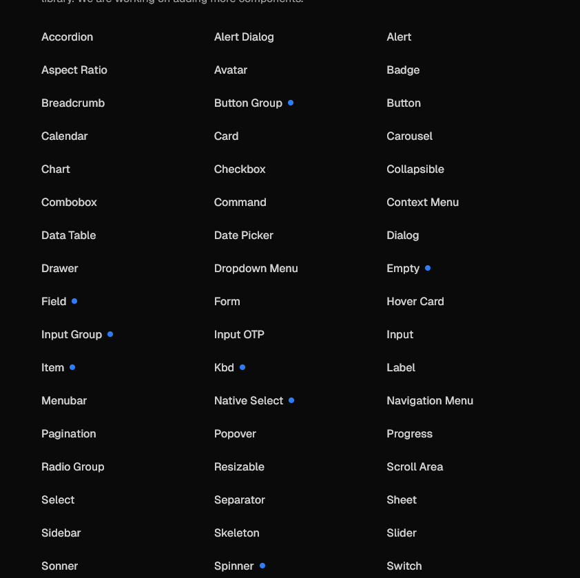
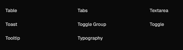
Provides a ready-to-use component library built on Tailwind CSS
- Open Code: The top layer of your component code is open for modification:
- Other UI libraries:
- Shadcn:
-
import * as React from "react"
import { Slot } from "@radix-ui/react-slot"
import { cva, type VariantProps } from "class-variance-authority"

import { cn } from "@/lib/utils"

const buttonVariants = cva(
  "inline-flex items-center justify-center gap-2 whitespace-nowrap rounded-md text-sm font-medium transition-all disabled:pointer-events-none disabled:opacity-50 [&_svg]:pointer-events-none [&_svg:not([class*='size-'])]:size-4 shrink-0 [&_svg]:shrink-0 outline-none focus-visible:border-ring focus-visible:ring-ring/50 focus-visible:ring-[3px] aria-invalid:ring-destructive/20 dark:aria-invalid:ring-destructive/40 aria-invalid:border-destructive",
  {
    variants: {
      variant: {
        default: "bg-primary text-primary-foreground hover:bg-primary/90",
        destructive:
          "bg-destructive text-white hover:bg-destructive/90 focus-visible:ring-destructive/20 dark:focus-visible:ring-destructive/40 dark:bg-destructive/60",
        outline:
          "border bg-background shadow-xs hover:bg-accent hover:text-accent-foreground dark:bg-input/30 dark:border-input dark:hover:bg-input/50",
        secondary:
          "bg-secondary text-secondary-foreground hover:bg-secondary/80",
        ghost:
          "hover:bg-accent hover:text-accent-foreground dark:hover:bg-accent/50",
        link: "text-primary underline-offset-4 hover:underline",
      },
      size: {
        default: "h-9 px-4 py-2 has-[>svg]:px-3",
        sm: "h-8 rounded-md gap-1.5 px-3 has-[>svg]:px-2.5",
        lg: "h-10 rounded-md px-6 has-[>svg]:px-4",
        icon: "size-9",
        "icon-sm": "size-8",
        "icon-lg": "size-10",
      },
    },
    defaultVariants: {
      variant: "default",
      size: "default",
    },
  }
)

function Button({
  className,
  variant = "default",
  size = "default",
  asChild = false,
  ...props
}: React.ComponentProps<"button"> &
  VariantProps<typeof buttonVariants> & {
    asChild?: boolean
  }) {
  const Comp = asChild ? Slot : "button"

  return (
    <Comp
      data-slot="button"
      data-variant={variant}
      data-size={size}
      className={cn(buttonVariants({ variant, size, className }))}
      {...props}
    />
  )
}

export { Button, buttonVariants }
-
- Distribution: A flat-file schema and command-line tool make it easy to distribute components.
-
npx shadcn@latest add button
-
- AI-Ready: Open code for LLMs to read, understand, and improve (mcp server).
-
{
  "registries": {
    "@acme": "https://acme.com/r/{name}.json"
  }
}
-
-
Figma designs give a visual reference for UI consistency
- Huge ecosystem built around shadcn.
-
Fits well with React and Next.js
- Very customizable :
- you can change the whole app theme by changing only globall.css file :
- change component source code.
Pros
-
Lightweight and modern styling approach
Cons
-
Learning curve for Tailwind if new to utility-first CSS
Alternative Approaches
-
Material-UI (MUI)
-
Ant Design
-
Chakra UI
-
Custom components from scratch
1. Mobile UI Approach:
What solution did I choose?
I chose not to use any mobile component library.
I use NativeWind for styling, along with Figma MCP, Figma Make, and Figma Dev Tools.
Why did I choose this solution?The app uses a fully custom UI designed in Figma, so prebuilt component libraries are not a good fit
NativeWind works like Tailwind CSS, making styling simple and consistent
Utility-based styling works well with LLMs for generating and adjusting UI code
Figma MCP and Figma Make help convert design decisions into implementation guidance
Figma Dev Tools allow developers and LLMs to inspect spacing, colors, and layout accurately